Keep a recognisable cue
The white frame around the magazine cover preserves a familiar part of GEO’s identity.
A new perspective on exploration.
An editorial redesign extending the world of GEO across a magazine, a digital experience and a physical display concept.
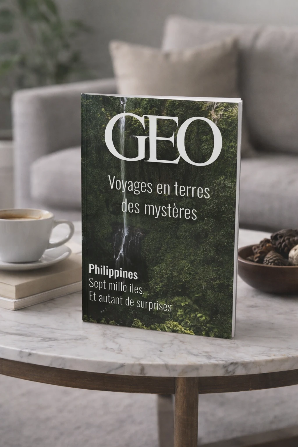
The project explores how an established travel magazine can feel contemporary while retaining its identity. The familiar white frame around the cover remains a recognisable starting point, with a refreshed approach to composition, hierarchy and photography.
The thinking behind the outcome.
The white frame around the magazine cover preserves a familiar part of GEO’s identity.
Large images and a clear typographic hierarchy support the travel and discovery theme.
The magazine, website and display stand extend the same visual direction across formats.
The direction connects the cover and interior layouts with a companion website and display stand. Photography drives the story, while typography and a consistent visual hierarchy organise content across print, screen and physical presentation.