Create a character
The tongue and torn opening turn the can into an expressive object with a cheeky personality.
A little weird. A lot of personality.
A playful sparkling-water packaging redesign, with a recognisable visual system across three flavours.
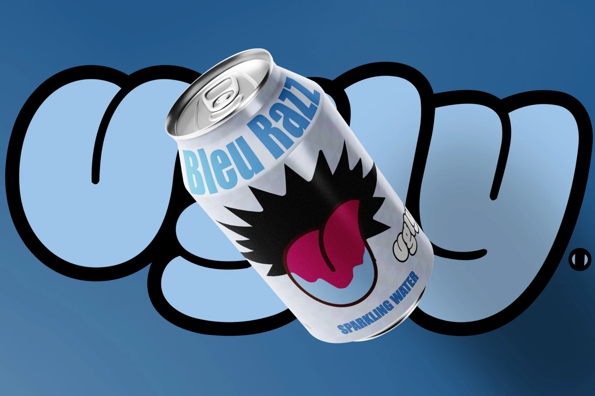
The brief was to refresh an existing drink for a younger audience while retaining its name, logo and required product information. The label needed to stand out at a glance and work as a complete packaging design, beyond the presentation mockup.
The thinking behind the outcome.
The tongue and torn opening turn the can into an expressive object with a cheeky personality.
Blue, pink and yellow give each flavour its own colour while the layout connects the range.
Label artwork includes product information and a structure developed for packaging production.
A tongue, a torn opening and a repeating triangle motif create a deliberately cheeky character. Blue, pink and yellow distinguish the flavours while the same layout keeps the range connected. The work developed from moodboards and sketches into label artwork and three can mockups.